arch/ive/ief (2000 - 2005)
|
belgium IMC homepage : a proposal / une proposition by red kitten Thursday April 19, 2001 at 12:52 PM |
| redkittenproduct@hotmail.com |
Voici une proposition pour la prochaine home page de archive.indymedia.be. Donnez vos avis, commentaire, conseils. Here's a proposal for next archive.indymedia.be's homepage. Send your comments, advices,...
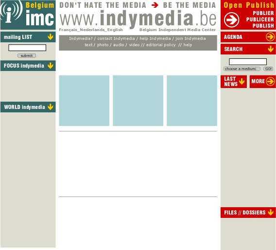
z-indymedia_homepage_051webcol2.jpg, image/jpeg, 568x514
|
Heel mooi by Mara Thursday April 19, 2001 at 01:21 PM |
J'aime bien !!! Heel mooi :-)
|
Je ne vois rien... by Olivier Thursday April 19, 2001 at 03:07 PM |
| alterecho@brutele.be |
Soit c'est extrêmement sobre, soit il y a un problème de chargement d'image.
|
Bien foutu by olivier Thursday April 19, 2001 at 03:11 PM |
| alterecho@brutele.be |
Suffit que je rouspète pour que ça marche...
Très beau design, ça me plaît bien (mieux que le précédent).
Remplace juste 'Last news' par 'Latest news'.
|
je ne vois rien by Bart Thursday April 19, 2001 at 04:28 PM |
je ne vois rien du tout :-((((((((((
|
youplaboun by sam Thursday April 19, 2001 at 11:38 PM |
bah ouais. Clair. Parfait. Stop. Allez hop sur le site. Stop. Tout de suite. Merci Tim. Stop
|
ik ben voor by han Thursday April 19, 2001 at 11:52 PM |
Ik vind het een mooi onwerp.
Ik denk dat het ook duidelijker gaat zijn.
Mischien ook uitwerken hoe we de vorpagina gaan invullen,....
|
c'est cool by Bart Friday April 20, 2001 at 10:16 AM |
| marescaux.vincke@pandora.be |
C'est cool. Je pense qu'il est mieux de changer le rouge a droite en vert du gauche ??
|
Bon travail! by Fred Friday April 20, 2001 at 11:09 AM |
Très bien ta proposition, redkitten!
Mais quelques petites remarques:
Je ne sais pas si le gris est le mieux pour le http://www.indymedia.org. Le noir serait peut-être mieux?
Pour Indymedia?/ Join Indymedia/ vidéo/ audio:...
C'est peut-être pas extrêmement clair. il faut peu^-être voir en plus grand.
Une autre petite chose, c'est ton habitude à utiliser ces doubles barres: //
J'avoue que je n'adore pas...
sinon c'est parfait. Cela me plaît
|
PFFFF to Fred ;-) by han Friday April 20, 2001 at 11:25 AM |
Pppfff
Have a look at indymedia germany, indymedia finland, indymedia France, imc sydney ...
And there go's your rule of Black
Just say you prefere black, ...
But every graphic designer will tel you why this is horrible choise.
I agree on the / and //
Why not use |
And I agree that it might be that the contact ... stuf might not be to clear.
...
|
noir/blanc by Fred Friday April 20, 2001 at 11:53 AM |
Je parle des lettes pas du fond, il peut rester blanc....
|
OK OK :-)) by han Friday April 20, 2001 at 12:16 PM |
OK OK,....
Should have a try,....
CIAO ;-)
|
sober and great by Anton Wednesday June 06, 2001 at 02:46 PM |
| anton@taiga.org |
I sure like this one.. Sober and just like any informative street sign or something...
God job red-K !
/Anton